In my recent Surface Go 2 column and the Lenovo IdeaPad Duet Chromebook, I put the challenge these devices present to the iPad as part of whether prospective buyers preferred a conventional window setting to the split-screen/floating window hybrid of the iPad. We’ve seen Microsoft wrestling aggressively for years with the right balance between touch and window environments from Windows 8 (in earnest) to Windows 10 (which can work very well but has seen slow adoption) and beyond to Windows 10 X,
Google has also been working to bridge desktop and mobile device differences. When I talked to the company as it released last year’s Pixelbook Slate, I agreed with its assessment that it made tremendous progress in incorporating Android apps into Chrome OS. However, it admitted that it still had a lot of work ahead of it. Indeed, while integrating Android apps made Chome OS a much more capable platform, especially for tablets, it compromised some of the simplicity of what could be an interface driven almost entirely by tab.
For example , making Android apps run within a browser tab could be helpful. While that is theoretically no different from a website, many parties simply imbue their apps with capabilities that are different from their websites. The factors range from avoiding app store revenue shares that preclude buying on the Kindle app to concentrating on a first-ever mobile experience that precludes payment through the Venmo web site.

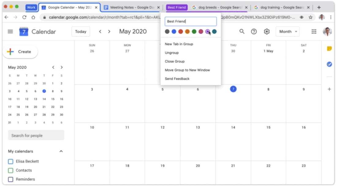
In any case, Google is turning its attention to tabs once again. It has introduced graphical site previews to touch-friendly tabs in Chrome OS 81, which appear with a swipe down from the top. The experience evokes the way they were handled by Internet Explorer back in Windows RT days. As with other Chrome OS touch facilities, it only operates when a Chromebook is in “tablet mode,” i.e. when there is no keyboard attached. Following this come news the company would formalize the grouping of tabs for better organization in Chrome, which was available experimentally.
These changes come on Microsoft’s heels showing up vertical tabs coming to Edge, revealed as part of Microsoft’s 365. These might not be as useful for organizing as the grouping of Chrome’s tab (whose usefulness can also be addressed with multiple windows and even multiple desktops) and will not do much to make touch friendly, but it is easy to see how a grouping feature could be implemented in the future. Even at startup, vertical tabs can do a better job of distinguishing between tab titles as the number of open tabs in a window increases. This is particularly true if you want to access, say, multiple YouTube videos which all share the same favicon. Ultimately, if the browser rivals choose to improve on each other’s work, neither improvement precludes the other.

These kinds of browser interface changes may be late, but they speak to the enhancements that users are getting thanks to increased rivalry between Google and Microsoft now that Edge has become a formidable Chrome competitor thanks to the adoption of the Chromium code and are important to combat planned changes to the iPad app interface as Apple invests in iPadOS.


Leave a Reply